Wellness
2021
When users don't scroll, question the test—not just the design
Driven by observing friends and family struggle with isolation during the first pandemic winter, I designed Hygge—a wellness application rooted in the Danish concept of comfort and intentional rest. Through a full Double Diamond process, I validated the concept with real users and iterated through multiple rounds of testing to create a functional prototype.
Usability testing drove a complete concept pivot
Users were interested in the Hygge concept but confused by the structured "daily ritual" approach. Testing revealed they needed flexible discovery, not prescribed workflows—leading to a redesign that simplified navigation and surfaced content immediately.
Problem area
Sensing anxiety about the first pandemic winter—and wanting to help
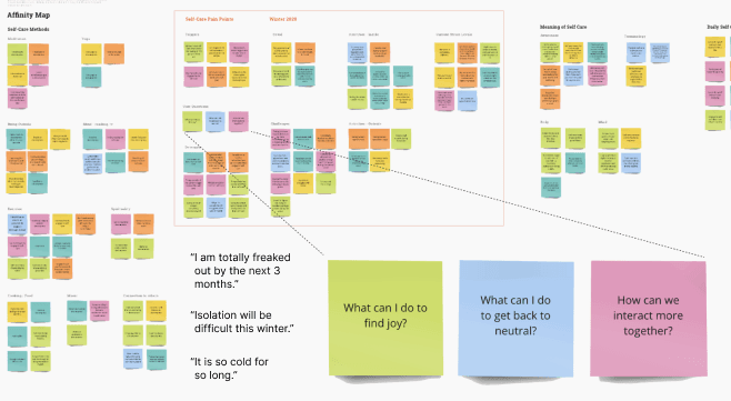
During the first winter of the pandemic, people were struggling with isolation and heightened stress but weren't utilizing self-care strategies. I hypothesized an application could help—but needed to validate whether this was a real problem and what kind of support would actually be useful.
What I Needed to Learn:
Question 2
What barriers prevented them from taking care of themselves?
Design decision 01
Research Validated the Emotional Need
I interviewed 6 users across cold climates and found significant anxiety about the upcoming months. Users wanted ways to feel present and find comfort—but didn't know how. This shaped the product direction: rather than task-based wellness activities, users needed something that helped them feel different about winter.
Interviews revealed winter anxiety, not just inconvenience
Design decision 02
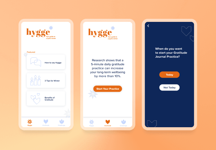
Terminology Pivot Based on Testing
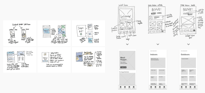
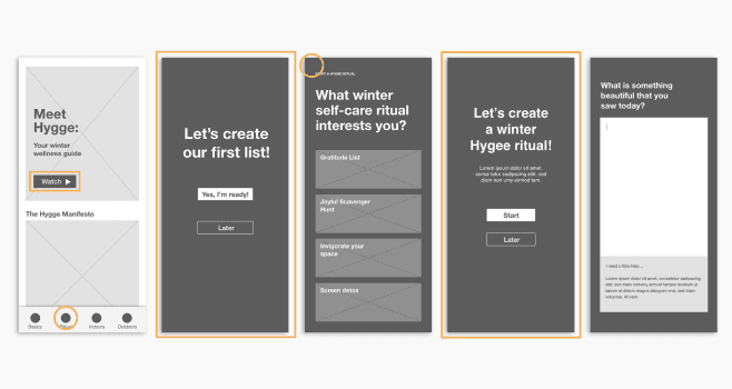
My first prototype focused on helping users create "daily rituals." Usability testing revealed the terminology was confusing and users didn't like being confined to structured workflows. I pivoted to simpler language and flexible content discovery, letting users explore rather than follow prescribed paths.
"Daily Ritual" confused users—plain language worked better
Design decision 03
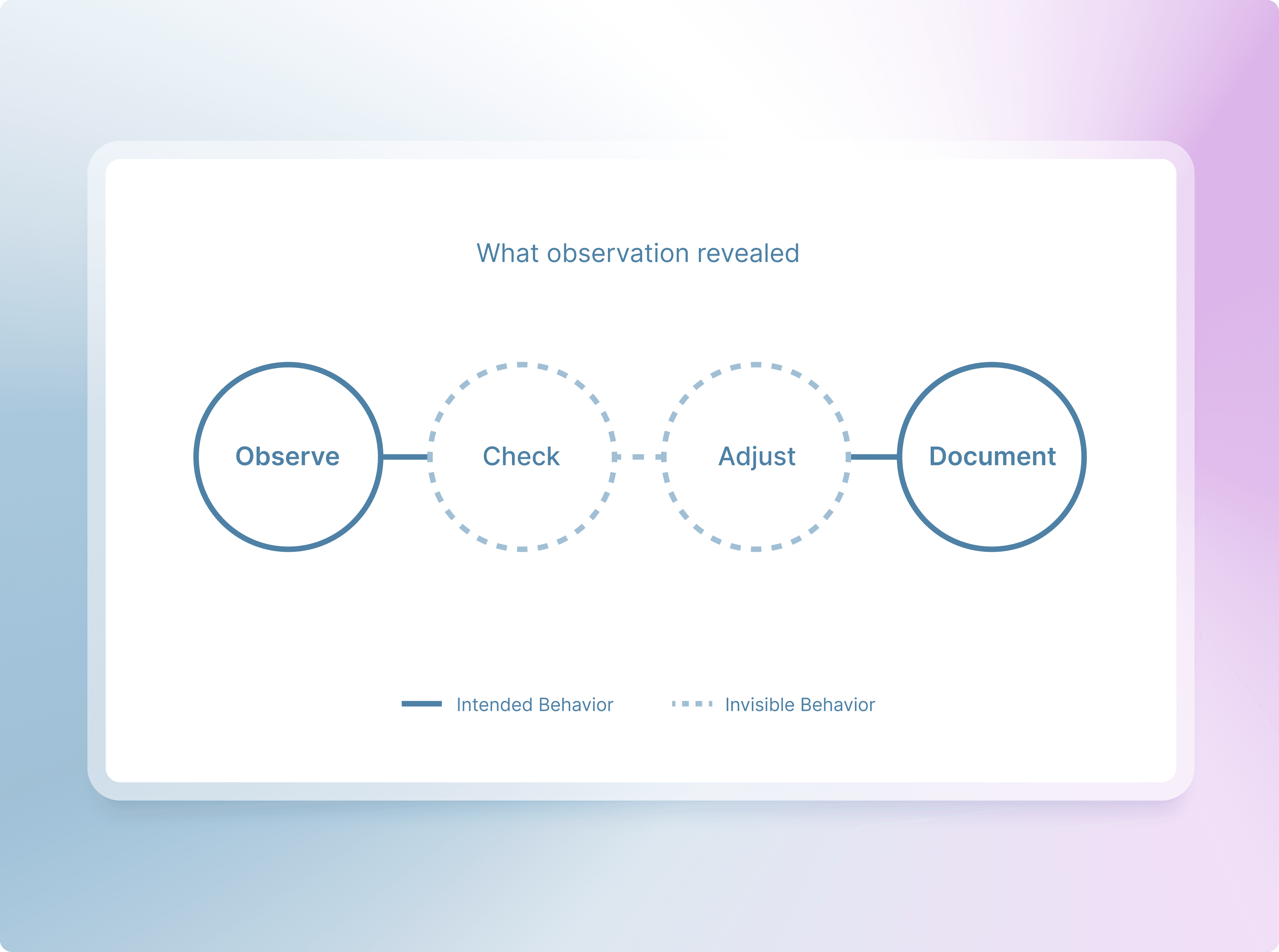
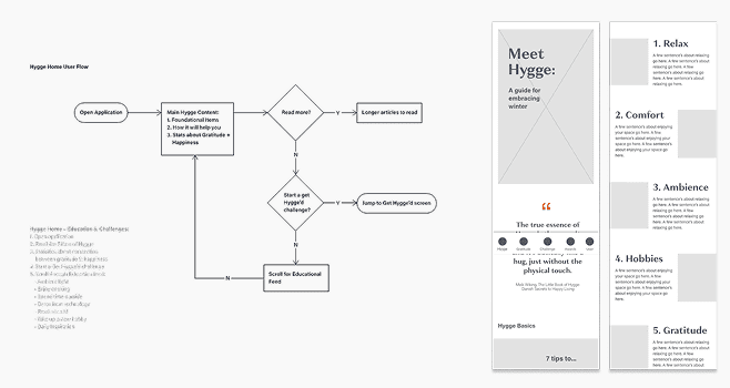
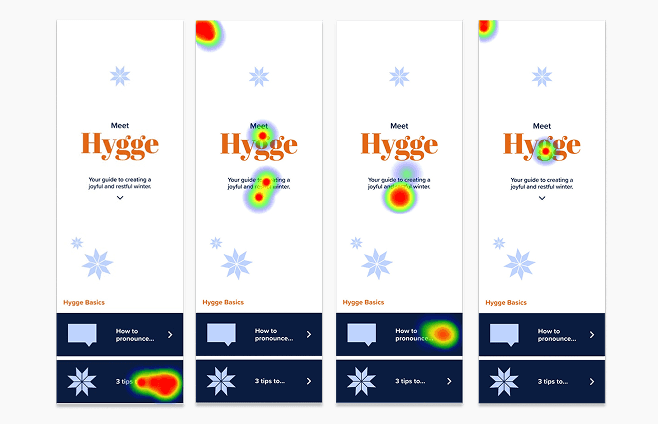
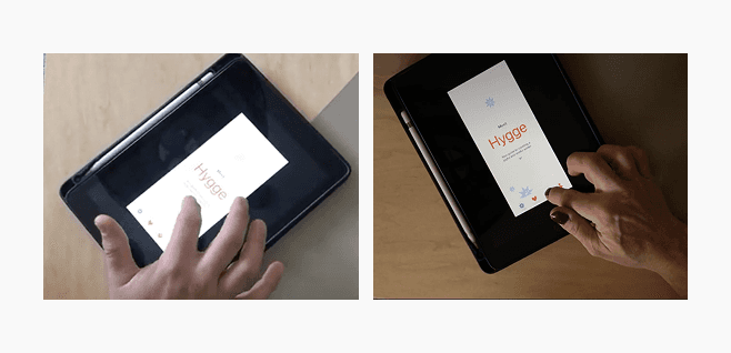
Solving the False Bottom
Heat maps showed users only clicking in the visible area. I ran moderated sessions on touchscreen devices to rule out testing artifacts. Result: the layout created a "false bottom." I redesigned with a Featured home screen that surfaced key content immediately, eliminating the need to scroll to discover core features.
Users weren't scrolling—on any device
Retrospective
Final testing confirmed the pivot worked
The biggest lesson wasn't about visual design—it was about questioning my assumptions at every level. Test your language as rigorously as your layouts. And when data surprises you, question the test setup as much as the design itself.